Dime Museum
Font Family by Solotype
Includes 1 Font Style from $19.95
Buy NowThis idea of 'wrong way weights' was originally called French Clarendon by the Americans, Italienne by the French, and American by the Italians. Sounds like nobody wanted to own up to it.
When it was revived by ATF in 1933, it was given the name P. T. Barnum. Many variations have appeared.
Dime Museum is an old wood type.
Test Drive
Type Your Text Here
Find More Fonts Like This: Handwritten Fonts and Special Effect Fonts
More Fonts From Solotype
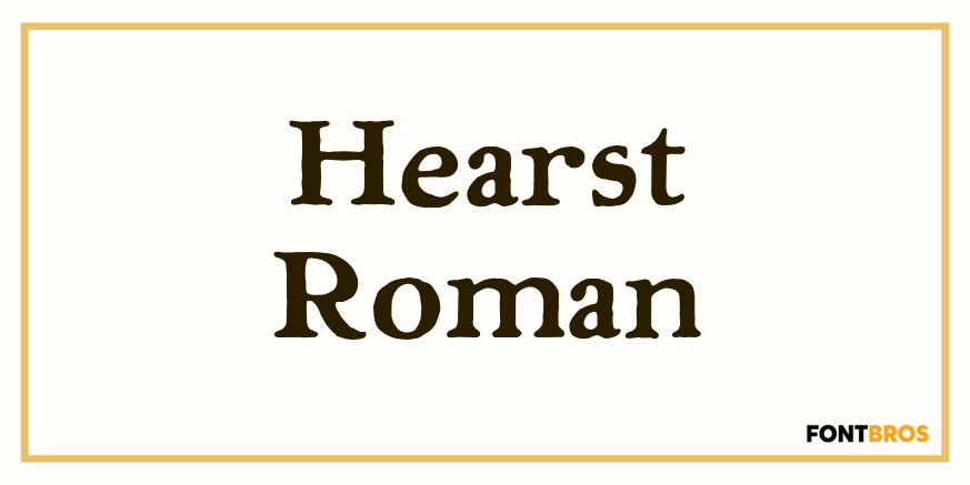
Hearst Roman | 1 Font | From $19.95
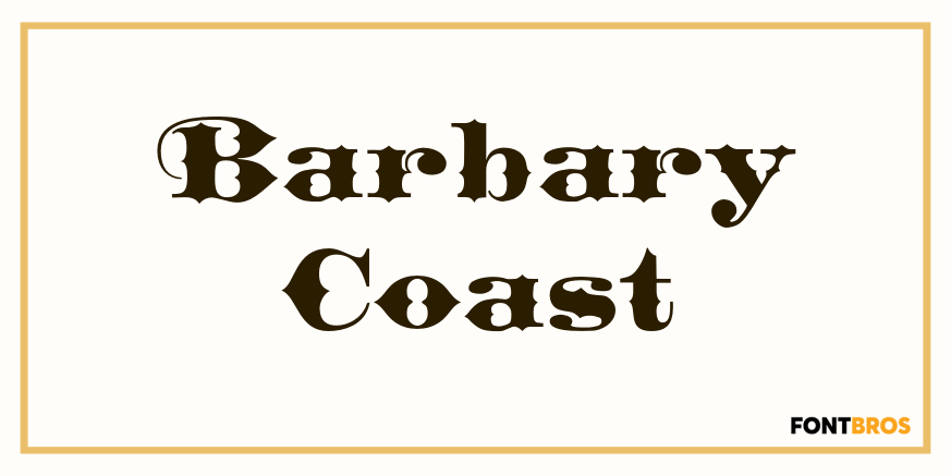
Barbary Coast | 1 Font | From $19.95
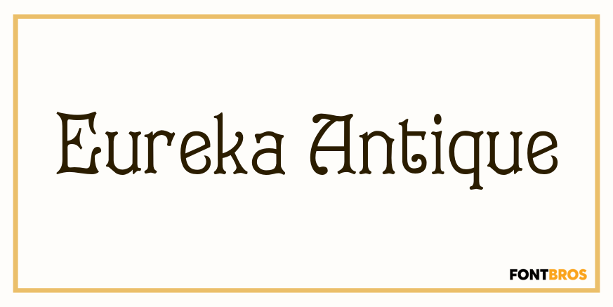
Eureka Antique | 1 Font | From $19.95