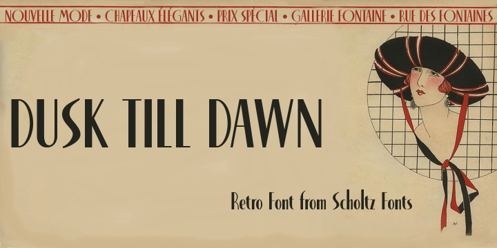
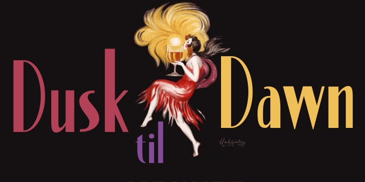
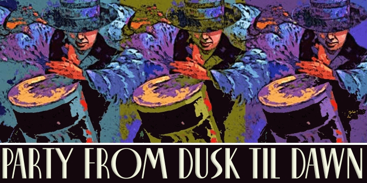
Dusk Til Dawn
Font Family by Scholtz Fonts
Includes 2 Font Styles from $29.95
Buy NowAs with Nocturne, Dusk til Dawn recalls the romantic, sophisticated Zeitgeist of the early 20th century, that nostalgic time ?between the wars?. It as a number of attractive ligatures and upper-case alternates.
I have used Nocturne as a basis for Dusk til Dawn, given the font really bold down-strokes, reduced the width of some upper case characters and changed the shape of many lower case characters.
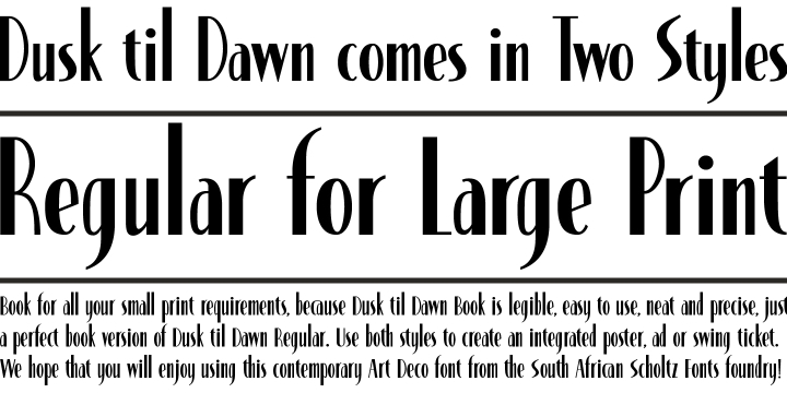
Dusk til Dawn Regular, which uses the Art Deco convention of small x height, and long ascenders. This Display style is perfect for headers, posters, labels etc.
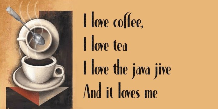
Dusk til Dawn Book, which, with its higher x-height and slightly wider characters, is extremely legible and suitable for longer passages of smaller size text.
Test Drive
Font Style
Font Size – 60px
Type Your Text Here
2 Fonts Included
Save 24% ($9.95) when you buy the full family!
Find More Fonts Like This: Art Deco (1910-1935) Fonts and Serif Fonts
More Fonts From Scholtz Fonts
Et Cetera | 3 Fonts | From $49

Thaun | 11 Fonts | From $55

Kau | 2 Fonts | From $29
