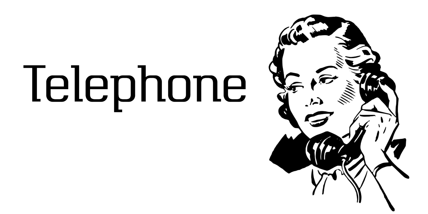
Telephone
Font Family by K-Type
Includes 8 Font Styles from $80
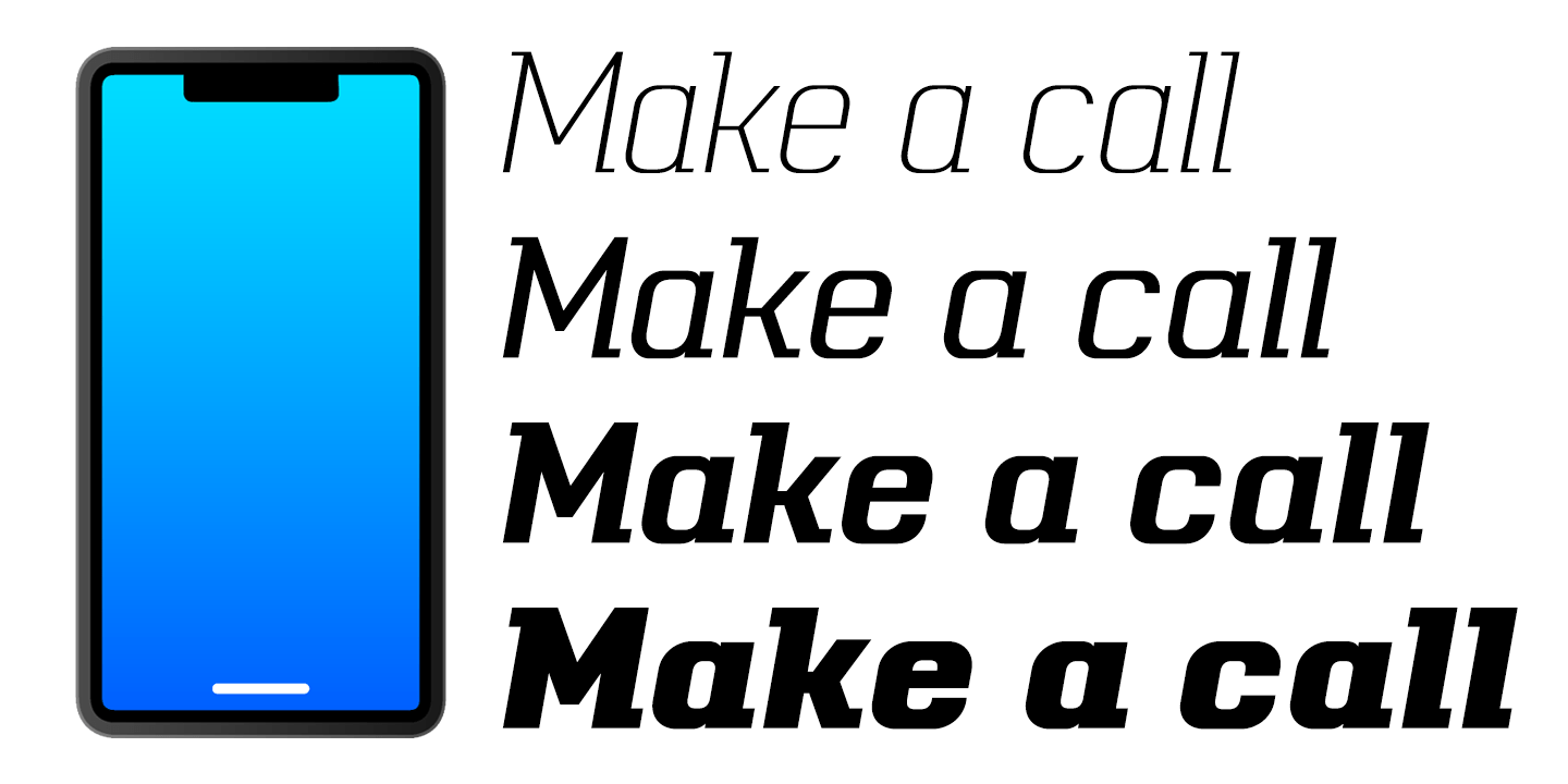
Buy NowTelephone is a geometric semi-slab family with block serifs positioned to assist wordflow.
The typeface evolved from an italic wordmark designed in 1966 for the British GPO by the Banks & Miles agency to publicize all-figure telephone dialling (all-number calling), and the new fonts retain that italic spirit, even in the upright romans. The squarish glyphs, with a mix of rounded and angular corners, have a post-modern feel suggesting technological advance, innovation and vitality.
A wide version of this typeface is also available ? Telephone Extended
Tags
advertisingbrandingdisplayheadingpackagingpostersci-fisemi- slabtitle
Test Drive
Font Style
Font Size – 60px
Type Your Text Here
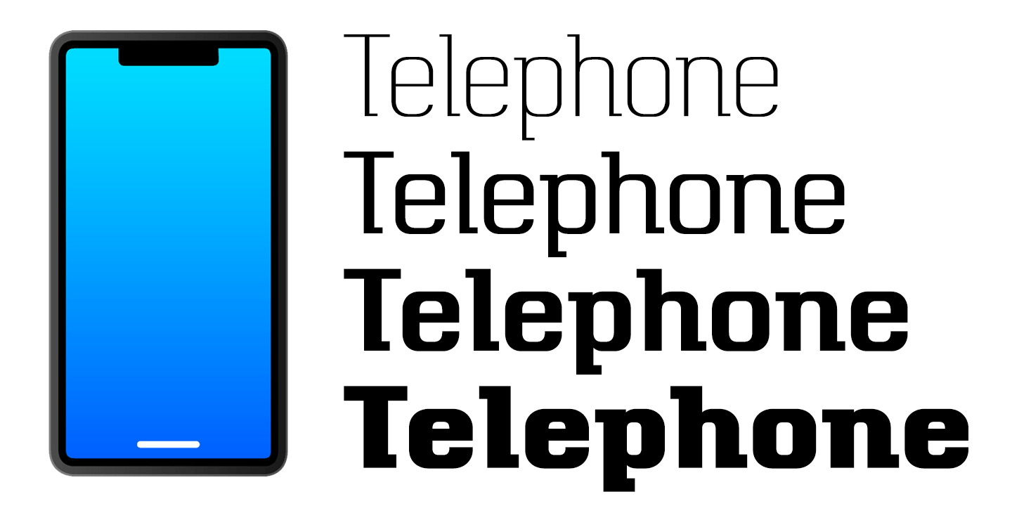
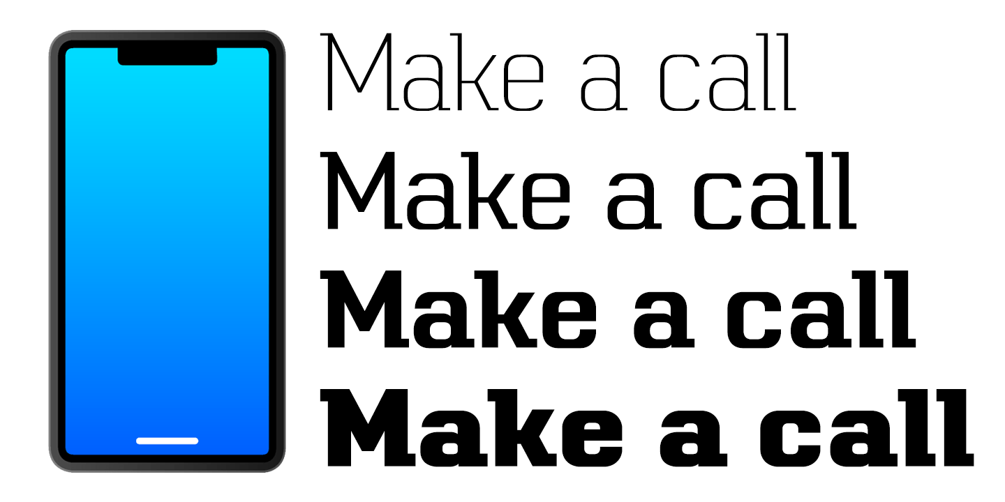
8 Fonts Included
Telephone Black Italic | View All 416 Glyphs
Telephone Black Italic
Telephone Black | View All 416 Glyphs
Telephone Black
Telephone Bold Italic | View All 416 Glyphs
Telephone Bold Italic
Telephone Bold | View All 416 Glyphs
Telephone Bold
Telephone Italic | View All 416 Glyphs
Telephone Italic
Telephone Regular | View All 416 Glyphs
Telephone Regular
Telephone Light Italic | View All 416 Glyphs
Telephone Light Italic
Telephone Light | View All 416 Glyphs
Telephone Light
Find More Fonts Like This: Retro (1936-1965) Fonts and Serif Fonts
Related Products
Telephone Black & Black Italic | 2 Fonts | From $20
Telephone Black & Black ItalicTelephone Bold & Bold Italic | 2 Fonts | From $20
Telephone Bold & Bold ItalicTelephone Regular & Italic | 2 Fonts | From $20
Telephone Regular & ItalicMore Fonts From K-Type
Block Capitals | 20 Fonts | From $200

We The People | 3 Fonts | From $20

Chancery Lane | 2 Fonts | From $20
