What's New
Selectronic
Newsletter
Please e-mail me updates and font release news!
Lust Didone Font by Positype

About:
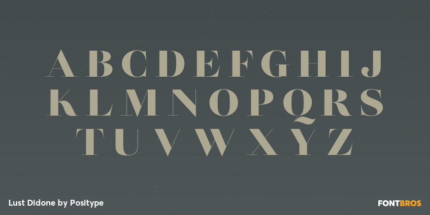
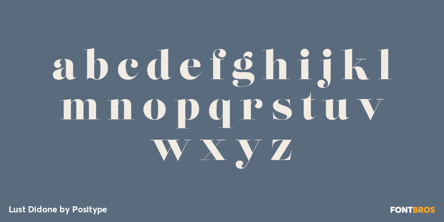
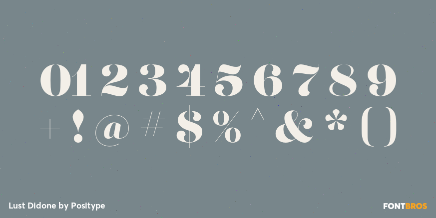
Lust is my overly indulgent attempt to infuse wanton sensuality in a typeface. The solution was to create a curvy serif. Lots of contrast, almost demure, coy contrast mixed with the flowing curves of a woman’s body, incomplete, almost teasing ball terminals, and serifs that went on forever - so sharp they would draw blood if you touched them.
The result yielded a rather diverse typographic gene pool: a little Scotch Modern, a little Didone and Didot, a dominant dose of Caslon, and a pinch of Baskerville - all wrapped up in the leggy body of a Brazilian supermodel. A confident, self-reliant typeface that shows just enough to keep everyone staring and leave them wanting more. With this design done, I moved to make it even more desirable and created the display variants with double the contrast!
WARNING! Please know what you are getting into with this typeface. Like a supermodel, it can't be squeezed into every situation. It needs room and size to breathe. The regular weights can support 36-point or higher settings, whereas the display weights shine above 72-point (preferably 100-point).
Lust is packed with alternates to play with - enough to turn you on and satisfy. Utilizing the OpenType features (and Glyph palette) wisely will have you weaving through endless variations of Stylistic, Contextual, Titling, Historical and Swash alternates - and the Italic styles feature a Contextual system that allows you to switch seamlessly between Didone and Scotch traits in order to better complement the upright variants.
Tags: 1940s, 1950s, 1960s, 1970s, Font, Groovy, Retro, Serif