
Test Drive
Type Your Text Here
Find More Fonts Like This: Futuristic Fonts, Groovy (1966-1978) Fonts, and Sans Serif Fonts
Related Products
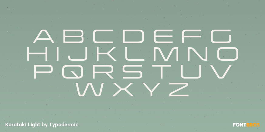
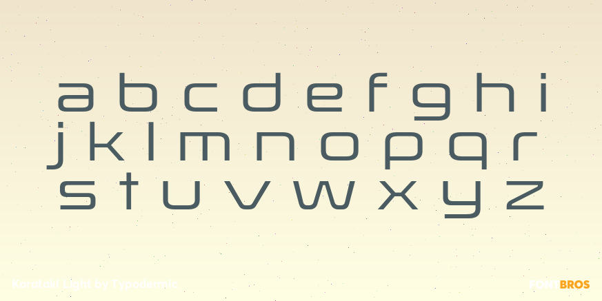
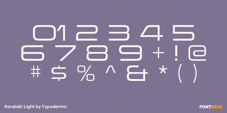
Korataki | 14 Fonts | From $169.95
KoratakiMore Fonts From Typodermic
Usurp | 1 Font | From $69.95

Acroyear | 1 Font | From $69.95

Flyswim | 1 Font | From $69.95
