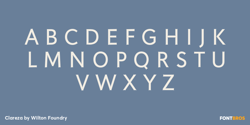


Clareza
Font Family by Wilton Foundry
Includes 2 Font Styles from $29
Buy NowClareza means ?Clarity? in Portuguese. That was exactly the goal in creating this font. We managed to create a font that is crisp and extremely legible at all sizes but then comes to life in an interesting and unusual way when used as a display font. The glyph traps are at the heart of Clareza's unusual style: they were carefully designed to become a great feature at display sizes, adding an interesting personality without dominating.
Clareza is a solid Geometric workhorse ideal for clear, legible, applications including branding, advertising and signage. If you are looking for a font that is crisp with a little more personality, Clareza will absolutely fit the bill!
Test Drive
Font Style
Font Size – 60px
Type Your Text Here
2 Fonts Included
Clareza Italic | View All 231 Glyphs
Clareza Italic
Clareza Regular | View All 229 Glyphs
Clareza Regular
Find More Fonts Like This: Modern/Contemporary Fonts and Sans Serif Fonts
More Fonts From Wilton Foundry
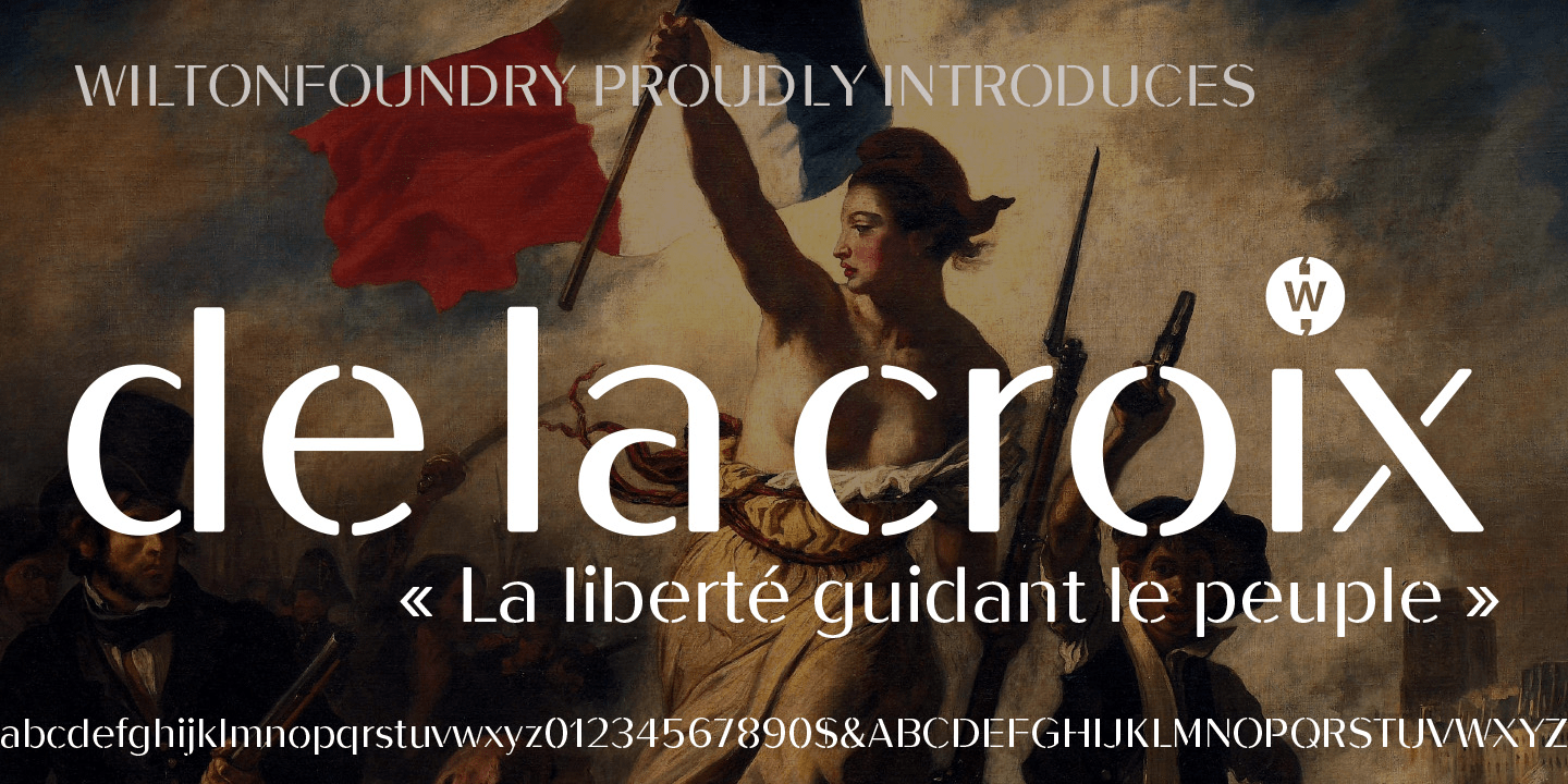
De La Croix | 1 Font | From $19
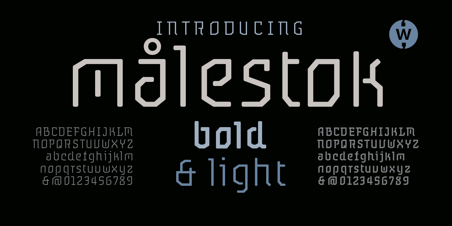
Målestok | 4 Fonts | From $69
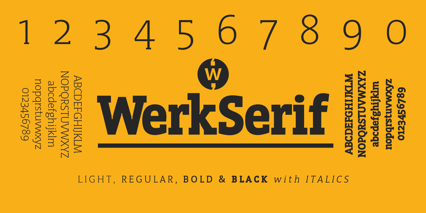
Werk Serif | 8 Fonts | From $80